
Structure
Add nds-status-section to a content section. The variant centers every part, and it fills the leftover height when it is the only section on the page. Use it as a whole page, such as an error page or a confirmation page, or place it among the other sections of a longer page. The artwork slot takes one of two blocks: nds-section-icon for a status chip, or nds-section-image for an illustration.
Status
Set data-status on the section. That one attribute colors the title and paints the feedback chip, so the icon and the heading read as one message. The chip needs no status of its own: it takes the value from the section around it.
Request submitted
We received your request. A confirmation message arrives within three working days.
<section class="nds-content-section nds-status-section" data-status="success">
    <div class="nds-section-wrapper">
        <div class="nds-section-icon">
            <span class="nds-feedback nds-ring">
                <span class="nds-feedback-icon">
                    <i class="nds-icon" aria-hidden="true"></i>
                </span>
            </span>
        </div>
        <div class="nds-section-head">
            <h1 class="nds-section-title">Request submitted</h1>
            <p class="nds-section-description">We received your request. A confirmation message arrives within three working days.</p>
        </div>
        <div class="nds-section-action">
            <a href="/" class="nds-btn nds-primary">
                <span class="nds-label">Back to Home</span>
            </a>
        </div>
    </div>
</section>
Illustration
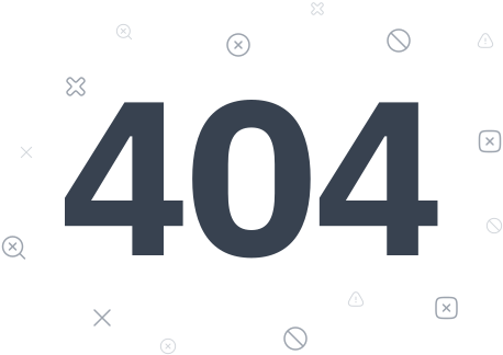
A page with artwork uses nds-section-image in place of the icon block, and drops data-status so the title keeps the default color. This is the shape the 404 template ships.
<section class="nds-content-section nds-status-section">
    <div class="nds-section-wrapper">
        <div class="nds-section-image">
            <img src="/assets/img/404.svg" width="458" height="324" alt="Page not found">
        </div>
        <div class="nds-section-head">
            <h1 class="nds-section-title">Something went wrong</h1>
            <p class="nds-section-description">Sorry, we couldn't find the page you're looking for</p>
        </div>
        <div class="nds-section-action">
            <a href="/" class="nds-btn nds-primary">
                <span class="nds-label">Back to Home</span>
            </a>
        </div>
    </div>
</section>
Usage Guidelines
Best Practices
- Put a whole-page status section inside the standard page shell. The shell fills the page height for you, and it holds the region until the styles land, so the message never paints unstyled
- Give the page one action, and make it the way out — back to home, back to the service, or retry. A dead end with no link is the one thing every error page must avoid
- Use the section title for the outcome and the description for what happens next. Keep both short: people read this page in a hurry
- On a standalone page the title is the page heading, so use
h1. Inside a longer page it is one heading among others, so follow the page's own heading order - Pick the status by meaning, not by color:
successfor work that completed,errorfor work that failed,warningfor work that needs attention,infofor a plain notice - Use an illustration for pages with their own artwork, and the chip everywhere else. Ship one block or the other, not both
Reference
| Name | Where | Description |
|---|---|---|
.nds-status-section | On the section | Centers every part, fills the leftover page height, and keys the status colors |
.nds-section-icon | In the wrapper | Centering box for a feedback chip. Same box as .nds-section-image |
data-status | On the section | success, info, warning, error, critical. Colors the title and paints the chip |
.nds-404 | On the section | The old name of this variant, kept for pages copied from the previous 404 template. Use .nds-status-section in new work |
--feedback-size | On the section | Chip diameter, 56px here. See feedback icons |