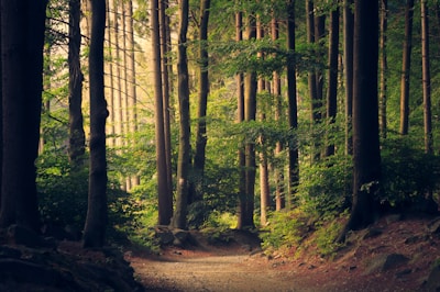
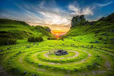
Image Gallery
Click any thumbnail to open the full-screen viewer with zoom and navigation controls


Built-in Features
What you get out of the box with zero configuration
Any image with the nds-ipv-thumbnail class becomes clickable and opens in the full-screen viewer. No extra markup or JS calls needed. For dynamically added images, call NDS.Ipv.init().
Zoom into images using mouse wheel (centered on cursor position), keyboard shortcuts (+/-), pinch-to-zoom on touch devices, or the on-screen zoom buttons. Supports 0.1x to 10x magnification.
Click and drag on desktop or swipe on touch devices to pan around zoomed images. Double-click or double-tap resets the view to the original position and zoom level.
When multiple thumbnails share a gallery container, arrow buttons and keyboard left/right keys navigate between images. An image counter displays the current position.
Full keyboard support: Escape closes the viewer, +/- adjusts zoom, 0 resets the view, H toggles the control UI, and arrow keys navigate between images.
Pinch-to-zoom with two fingers centers on the gesture midpoint. Single-finger drag pans the image. All gestures work alongside on-screen controls on mobile.
Press H or tap the toggle button to hide all controls, navigation, and overlays for a clean viewing experience. Toggle again to restore the full UI.
Thumbnails load at a small size for fast page rendering, then the full-resolution image loads on demand when opened. A loading spinner displays while the full image is fetched.
Usage Guidelines
When and how to use the image popup viewer effectively
Best Practices
- Use the image popup viewer for any content where users need to inspect image details: product photos, maps, infographics, architectural plans, or document scans. The zoom and pan controls let users explore at their own pace.
- Use the gallery layout (
nds-ipv-gallery) to group related images with shared navigation. Users can browse through all images with arrow keys or on-screen buttons without closing and reopening. - Use standalone thumbnails outside a gallery when images are independent of each other. Each
nds-ipv-thumbnailopens its own viewer without gallery navigation. - Do not use the image popup viewer for decorative or background images that don't benefit from close inspection. Only apply it to images where zoom and detail matter to the user.
- Do not use this component for modal dialogs with mixed content. Use Modal instead when you need text, forms, or actions alongside an image.
- Always provide a
data-ipv-fullattribute pointing to a high-resolution version of the image. Without it, the viewer falls back to the thumbnail src, which may look blurry when zoomed. - Keep thumbnail images small (400px wide) for fast page load. The full-resolution image loads on demand only when the user opens the viewer.
- Write descriptive
alttext on every thumbnail. The viewer inherits this for accessibility. - Add
nds-ipv-image-titlebelow thumbnails in galleries to give users context before they open the viewer.
Data Attributes
| Attribute | Description |
|---|---|
data-ipv-full | Set on the thumbnail <img> to specify the full-resolution image URL loaded when the viewer opens. |
JavaScript API
The NDS.Ipv API controls initialization and programmatic access. The viewer auto-initializes on page load. For dynamically added thumbnails, call NDS.Ipv.init() to re-scan the page.